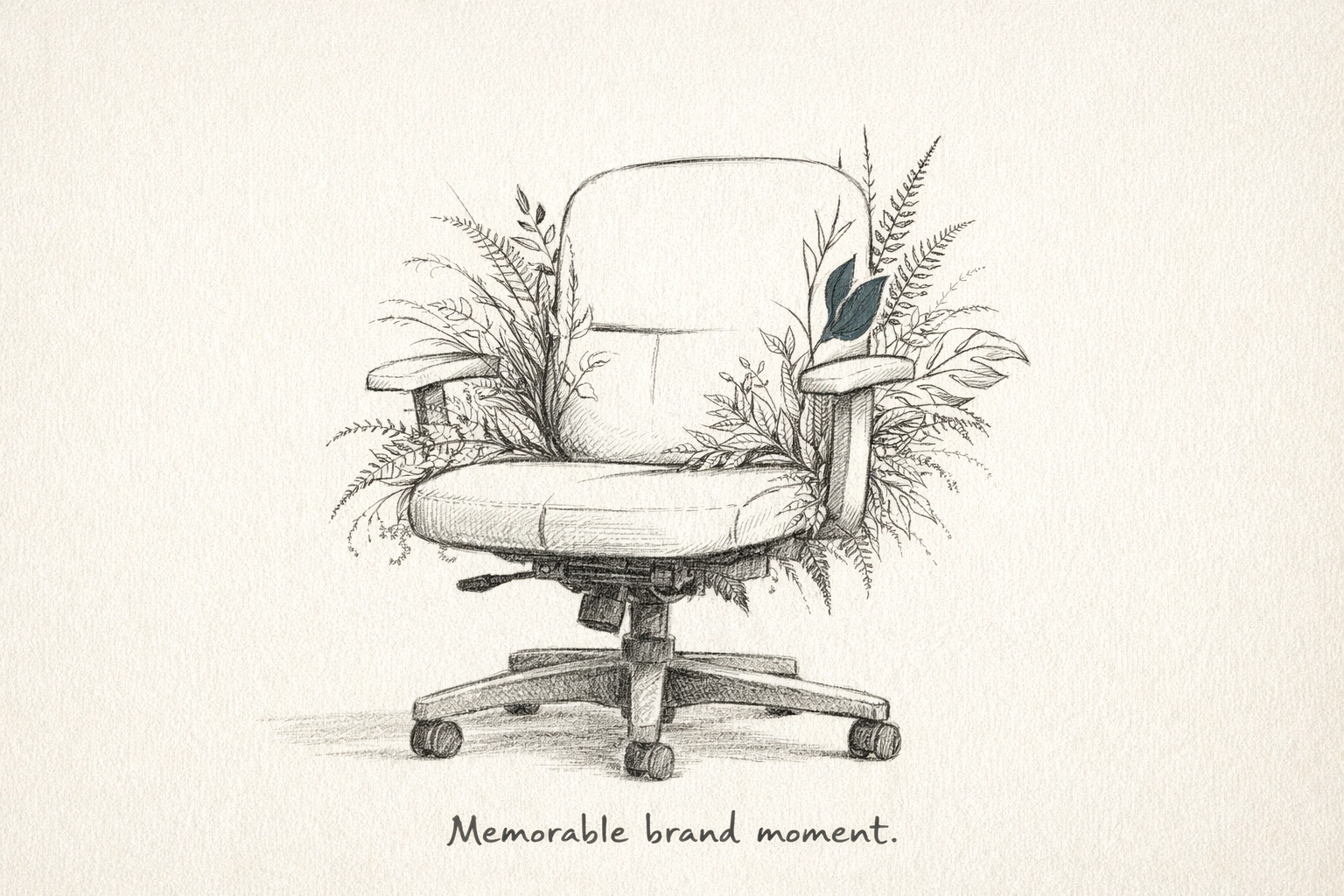
Visual literacy is no longer a luxury. It is a baseline requirement for market relevance.
In the high-stakes landscape of digital first impressions, you have approximately 250 milliseconds to capture, retain, and direct a prospect’s attention. Your audience does not read your website; they scan it. They do not analyze your brand; they feel it.
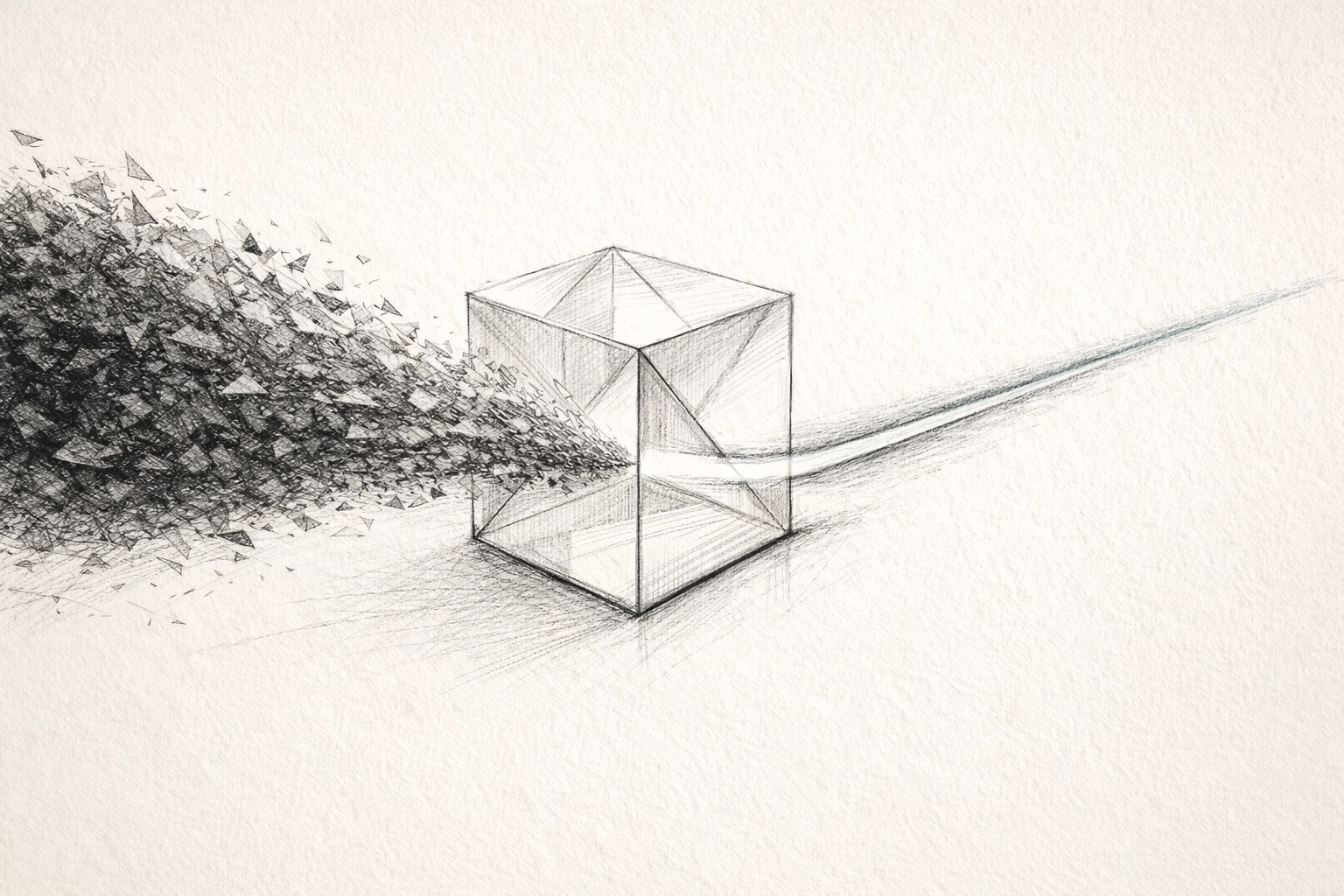
The human brain processes imagery 60,000 times faster than text. While your competitors are busy fine-tuning paragraphs of marketing copy that will ultimately go unread, the most sophisticated brands are investing in custom illustration.
This isn't about "art." It is about cognitive ergonomics. It is about reducing the friction between your value proposition and your customer’s understanding.
At Tevao Creative, we view illustration as a proprietary strategic asset: a visual shorthand that bypasses the logical hurdles of language to establish immediate, emotional, and commercial authority.
THE PROBLEM: THE COMMODITIZATION OF STOCK
Stock photography is the beige wallpaper of the digital world. It is recognizable, forgettable, and: most damagingly: it signals a lack of original thought. When you use the same library assets as your competitors, you are unintentionally telling your prospects that your solution is just as interchangeable.
Custom illustration provides the "fingerprint" of the brand. It is an exclusive visual language that competitors cannot replicate. It transforms abstract concepts into tangible, scannable assets that drive ROI through clarity.
Here are five strategic pillars where custom illustration creates a definitive competitive edge.
1. ACCELERATED INFORMATION TRANSFER
The Friction: Complex SaaS platforms, technical services, and high-level consulting often struggle with "The Wall of Text." Busy decision-makers do not have the cognitive surplus to decode 800 words of technical specifications on a landing page.
The Strategic Intervention: The human visual system requires only 1/10th of a second to interpret a visual symbol. Custom illustrations function as universal icons. They translate dense data into intuitive shapes and metaphors. Whether your audience is in Vancouver or Berlin, a well-executed illustration communicates the same core message without the need for translation.
The Commercial Outcome: Reduced bounce rates. When a user understands what you do within the first second of landing on your page, the barrier to engagement vanishes. You aren't just showing a picture; you are installing knowledge directly into their subconscious.
2. DYNAMIC BRAND AUTHORITY
The Friction: Traditional photography is static. It is bound by the constraints of reality: lighting, diverse representation, and physical locations. This often results in a brand identity that feels rigid or, worse, dated.
The Strategic Intervention: Illustrations are not "cartoons." In a premium brand positioning context, they are sophisticated tools for micro-interaction. By incorporating custom icons and subtle animation, you create a sense of life within the digital experience. These micro-moments of delight signal a high level of craftsmanship and attention to detail.
The Commercial Outcome: Perceived authority. A brand that invests in a custom-built visual infrastructure is perceived as more stable, more professional, and more capable of delivering high-end results. You are signaling that you do not cut corners.
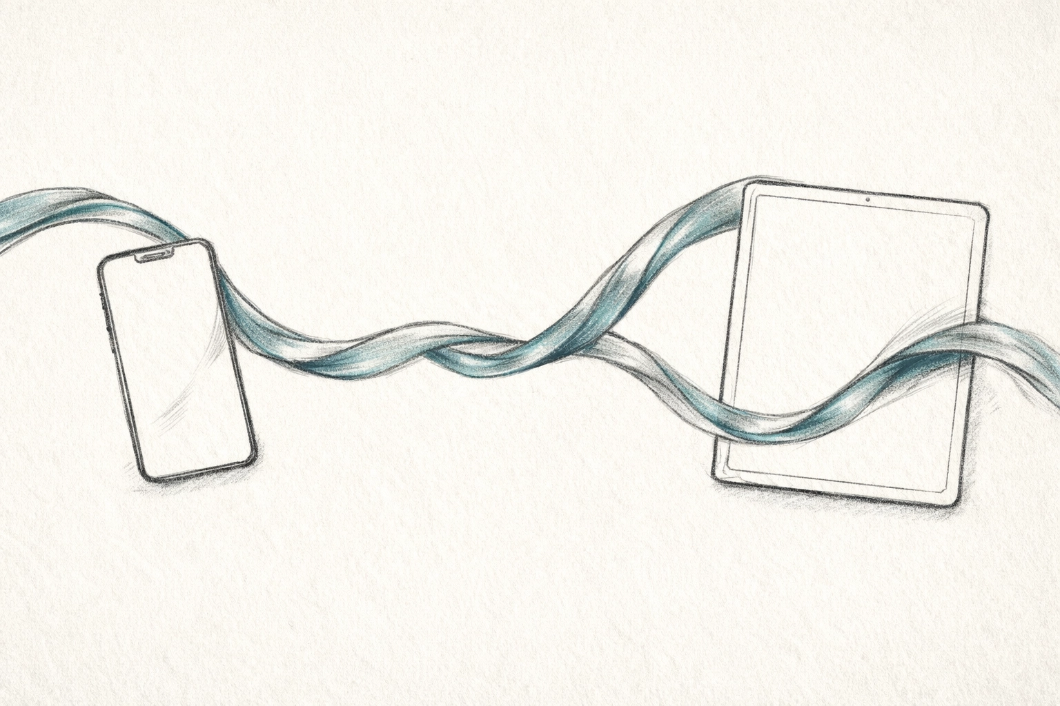
3. COHESION ACROSS THE CUSTOMER JOURNEY
The Friction: Most brands suffer from "identity fragmentation." Their website looks different from their pitch decks, which look different from their social media assets. This fragmentation creates a subtle sense of distrust in the prospect's mind.
The Strategic Intervention: Custom illustration acts as the connective tissue of your brand. A specific line weight, a curated color palette, and a unique character style can follow a prospect from their first Instagram ad to the final client portal login. It is a persistent reminder of who you are, creating a sense of familiarity that breeds trust.
The Commercial Outcome: Shortened sales cycles. Trust is the primary currency of the B2B and premium B2C markets. When a brand feels cohesive, the perceived risk of the transaction decreases.
4. OPERATIONAL UX EFFICIENCY
The Friction: Users are "skimmers" by necessity. If they cannot find the "Solution" or the "Price" within three seconds of scrolling, they will leave. Text-heavy layouts increase cognitive load, leading to "decision fatigue."
The Strategic Intervention: Creative illustrations function as visual signposts. They guide the eye toward critical calls to action. By using imagery to anchor your most important headers, you create a messaging hierarchy that respects the user's time. You are effectively "pre-digesting" the information for them.
The Commercial Outcome: Higher conversion rates. Efficiency in website infrastructure isn't just about load speeds; it’s about the speed of comprehension. Illustrations ensure that even the most distracted user walks away with your primary brand message intact.

5. THE PEAK-END RULE: PSYCHOLOGICAL RETENTION
The Friction: In a saturated market, being "good" is a baseline. Being "memorable" is the challenge. Most brand experiences are mediocre and, therefore, invisible.
The Strategic Intervention: Behavioral economics teaches us the "Peak-End Rule": people judge an experience based on its most intense point (the peak) and its conclusion (the end). A custom, thought-provoking illustration or a witty animation provides that "peak." It is an unexpected moment of creativity that breaks the monotony of the digital scroll.
The Commercial Outcome: Brand recall. When your prospect is ready to buy six months from now, they won't remember your bullet points. They will remember the brand that made them think, smile, or understand a complex idea instantly.
BEYOND AESTHETICS: THE ROI OF INTENTIONALITY
If you still believe that illustration is a "nice-to-have" design flourish, you are overlooking a critical component of modern commercial strategy.
Custom illustration is an investment in your brand’s scalability. Unlike stock photography, which requires constant licensing renewals and updates to avoid looking "trendy" or "dated," a custom visual language evolves with you. It is a proprietary asset that adds measurable value to your company’s balance sheet.
Strategic Benefits Summary:
- Market Differentiation: Occupy a visual space that your competitors cannot buy.
- Cognitive Relief: Win the war for attention by being the easiest brand to understand.
- Emotional Resonance: Connect with stakeholders on a human level, bypassing the corporate "noise."
- Infrastructure Consistency: Maintain a high-fidelity presence across every digital and print touchpoint.
ELIMINATING THE FRICTION
The decision to move away from generic visuals is the decision to claim your space in the market. It is a shift from "blending in" to "commanding attention."
At Tevao Creative, we don't just "draw." We architect visual systems designed to drive engagement and reinforce your strategic positioning. We strip away the fluff to reveal the core of your brand through intentional, minimalist, and high-impact design.
The speed of sight is your greatest advantage. Do not waste it on the mediocre.
Ready to define your brand’s visual infrastructure?
Stop settling for the generic. Let’s build a visual language that works as hard as your business does.
Book your Premium Brand Positioning Review or Connect with our team to begin the transformation.
![[HERO] Brand Strategy Mistakes: 7 trust-killers to avoid](https://tevaocreative.com/wp-content/uploads/2026/03/11-300x200.png)
![[HERO] Brand Strategy Execution: The "Last Mile" Problem.](https://tevaocreative.com/wp-content/uploads/2026/03/Tevao-blog-post-hero13-300x200.png)
![[HERO] Is Your Brand a "Franken-brand"? How to Build Scalable Systems for Your Business](https://tevaocreative.com/wp-content/uploads/2026/03/12-300x200.png)