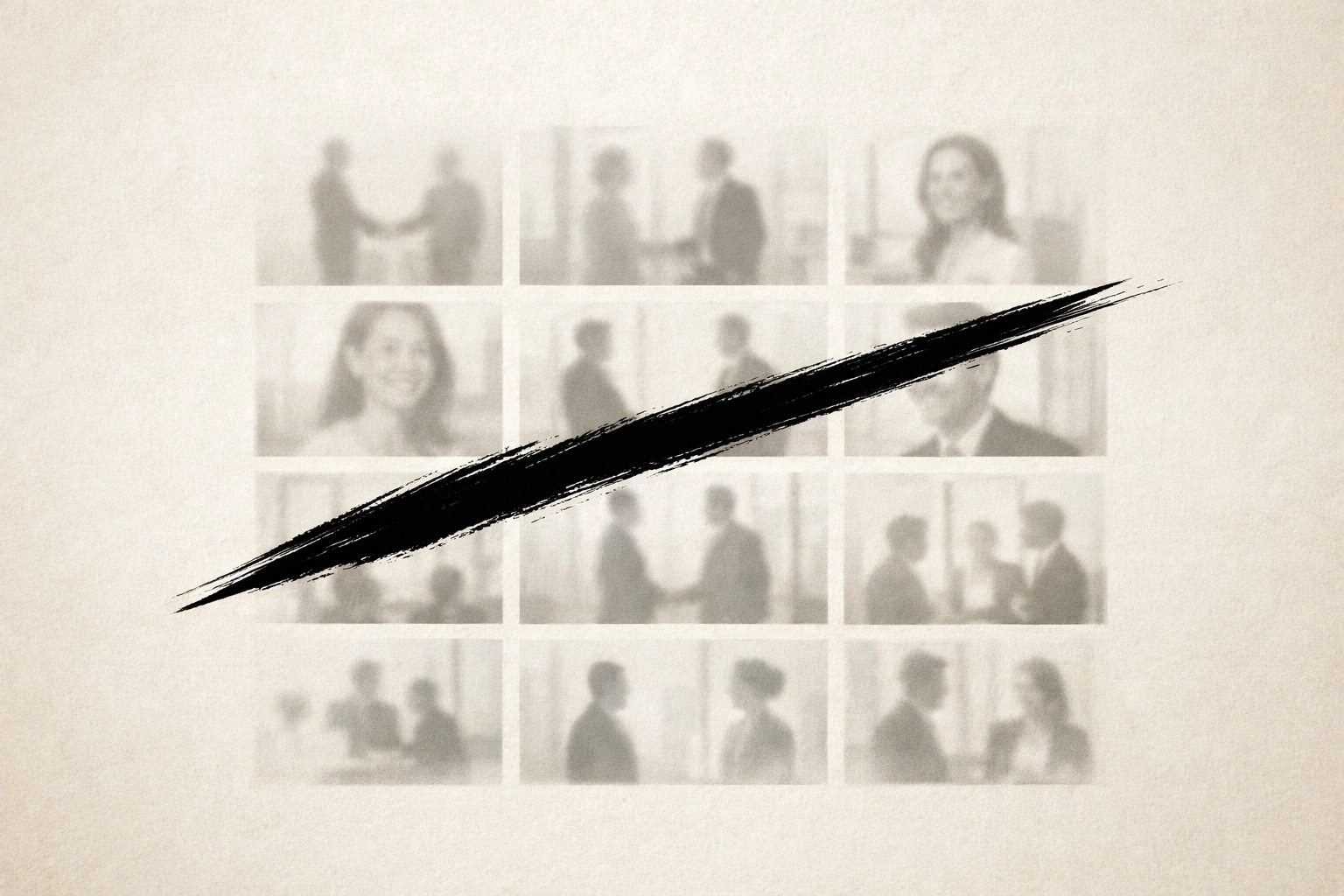
Stock photography is a commodity. It is safe. It is also invisible.
In a market saturated with generic "corporate" aesthetics, your brand’s visual identity often becomes its greatest friction point. When every competitor uses the same licensed imagery, your unique value proposition is diluted. You are no longer a market leader; you are a background noise.
At Tevao Creative, we view design not as decoration, but as infrastructure. Custom illustration is the visual fingerprint of a sophisticated brand. It is an intentional, strategic choice to own your narrative.
The Problem: The Visual Commodity Trap
Most brands suffer from visual stagnation. They rely on stock libraries that offer:
- Zero exclusivity.
- Fragmented brand messaging.
- Inconsistent quality.
- Emotional detachment.
When your audience sees a stock photo of "collaboration" or "success," they don't see your company. They see a placeholder. They see an absence of intention. This is where conversion dies.
The Solution: Strategic Illustration
Custom illustration moves beyond "cartoons." It is a high-end editorial tool designed to solve complex communication problems. It distills abstract concepts into clear, memorable, and proprietary visual assets.
It is not about making things "look nice." It is about premium brand positioning.
Case Study: Creating a Narrative Universe
The Project: White Spot "Cluckaneers"
For the White Spot kids’ menu, the objective was deeper than simple entertainment. The goal was to create an immersive brand universe that resonated with families and built long-term brand affinity.
The Strategy: We developed the "Cluckaneer" crew: a cast of characters that blended humor with a distinct, sophisticated line style.
- Internal Frustration: Traditional kids' menus feel disposable and cluttered.
- Strategic Relief: A cohesive set of characters that can be deployed across digital platforms, physical menus, and merchandise.
This wasn't just drawing chickens. It was engineering a proprietary asset that competitors cannot replicate. It turned a transactional moment (ordering food) into an experiential one. This is how you build loyalty before a customer even reaches adulthood.
Case Study: Humanizing the Intangible
The Project: Meg Energy "Meg-A-Fits Man"
Complex service offerings: like employee benefits or insurance: often feel cold. They are buried in spreadsheets and fine print. When Meg Energy needed to communicate their comprehensive coverage plan, stock photography failed.
The Strategy: We introduced "Meg-A-Fits Man."
- The Conflict: Stock images of "man at dentist" or "man with baby" are forgettable. They lack a cohesive thread.
- The Resolution: A custom superhero character who navigates the mundane and the monumental.
By using a consistent character, we created a visual shorthand for the brand’s support system. Whether he was illustrating an employer-matched savings plan or a maternity top-up, the character acted as a bridge between the company and the employee.
It moved the conversation from "policy details" to "human experience." That is the power of a strategic visual hierarchy.

Case Study: The Scalable Legacy
The Project: Mainland Floral
Mainland Floral had a distinct advantage: a founder, Fred, who was already the face of the business. The challenge was translating that personal equity into a scalable, modern brand identity that worked across a fleet of trucks, trade show booths, and digital touchpoints.
The Strategy: We created a minimalist, sophisticated doppelganger of Fred.
- The Constraint: A real person cannot be everywhere at once. Photography dates quickly.
- The Outcome: A clean, vector-based illustration that is instantly recognizable.
Fred’s illustrated counterpart now lives on everything from sell sheets to delivery vehicles. It provides a level of brand consistency that photography simply cannot match. It is an asset that scales without losing its soul. It is clean, it is intentional, and it is unforgettably professional.
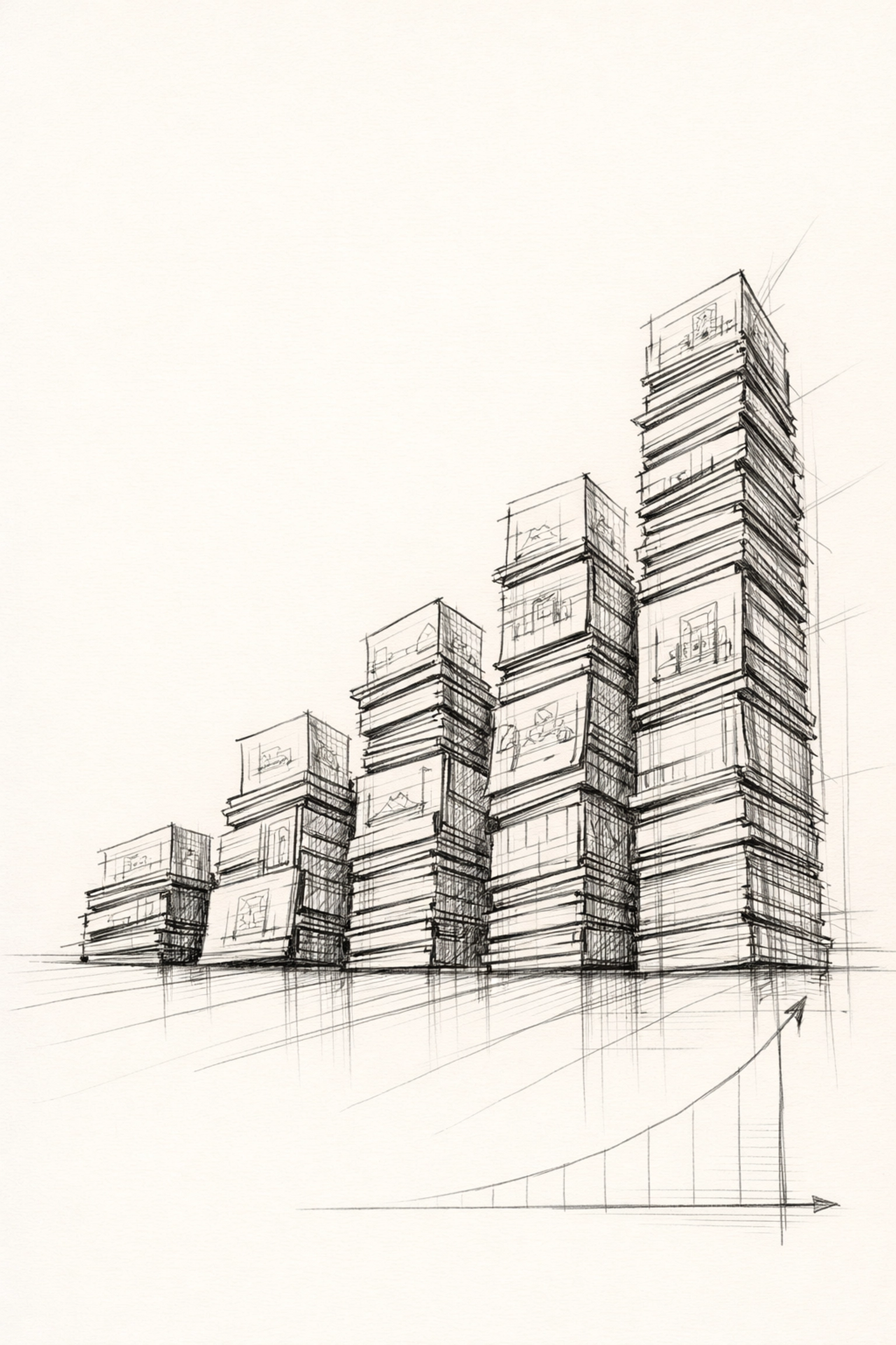
The ROI of Originality
A 2023 study by Venngage confirmed what we already knew: original illustrations are the top-performing type of visual content. Stock photos are the most unsuccessful.
The data is clear. Custom assets drive engagement because they signal authority.
Why strategic illustration works for your bottom line:
- Stakeholder Alignment: Custom visuals ensure everyone is seeing the same vision, literally.
- Frictionless Conversion: Illustration simplifies complex ideas, removing the mental "load" from the user.
- Operational Efficiency: Once a style is established, creating new assets for seasonal campaigns is streamlined and cost-effective.
- Brand Equity: You are building a library of assets that you own entirely. No licensing renewals. No "seen this before" moments.

Beyond the Aesthetic: Functional Design
At Tevao Creative, we don't believe in "fluff." We believe in systems.
When we integrate illustration into a website refresh, we aren't just adding pictures. We are building a visual language.
- Not during the strategy phase do we ignore your market position.
- Not under any circumstances do we use generic clip art.
- Not while your competitors are out-branding you will we remain silent.
Illustration allows us to push the limits of your imagination. Do you need an alien flying a spaceship filled with avocados to explain your logistics tech? We can do that. Do you need a minimalist, high-end editorial style to explain your legal firm’s approach to litigation? We can do that, too.
Try asking a photographer to recreate your brand's unique philosophy in a single afternoon. It won't happen.
The Tevao Methodology: Low-Drama Execution
Our process for custom illustration is as structured as our WordPress hosting.
- Phase 1: Discovery. We identify the messaging hierarchy. What is the one thing your audience needs to feel?
- Phase 2: Concepting. We develop the "visual fingerprint": the lines, the palette, the tone.
- Phase 3: Refinement. We ensure the assets are scalable and functional across all platforms.
- Phase 4: Integration. We deploy the illustrations across your digital and physical infrastructure.
The Bottom Line
Custom illustration is not a luxury. It is a strategic necessity for brands that refuse to be ignored. It is about perceived authority. It is about clarity. It is about ensuring that when a potential client lands on your page, they know exactly who you are: and they know you aren't like the rest.
Stop settling for the generic. Stop hiding behind stock photography that doesn't tell your story.
Your brand deserves a visual identity as unique as your business model.
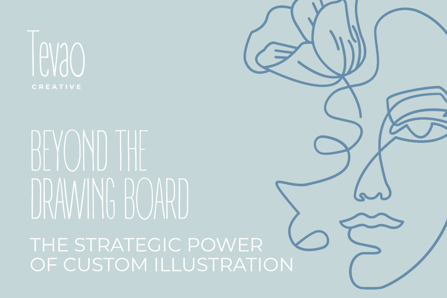
Ready to elevate your visual strategy? Let’s move beyond the drawing board.
Contact Tevao Creative today to discuss how custom illustration can transform your brand positioning.
![[HERO] 7 Graphic Design Mistakes & How to Fix Them](https://tevaocreative.com/wp-content/uploads/2026/03/7-2-300x200.png)
![[HERO] Custom Illustration Services: Why Human Craft Wins in 2026](https://tevaocreative.com/wp-content/uploads/2026/03/14-300x200.png)
![[HERO] Intentional Design: Why Your Branding Needs Purpose to Grow](https://tevaocreative.com/wp-content/uploads/2026/03/15-300x200.png)