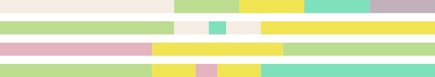
Unless you’ve been living under a rock – who hasn’t felt that way at least once this past year – you’ve probably heard of the Pantone Color of the Year. For 2021 the color forecasting folks, perhaps knowing we could all use a little bonus gift (or to make up for saddling us with a buzz-killing ‘blue’ in 2020), announced not just one but two colors – Ultimate Gray and Illuminating (a sunny yellow).
Pantone says this “marriage of color,” sends “a message of strength and hopefulness that is both uplifting and enduring.” Exactly what we all need right now, right?
But before you go saturating everything from your website background to your business card in these two “rock solid” and “warming and optimistic” shades know that Pantone has actually released three whole palettes of color trend highlights for Spring/Summer 2021.
This marriage of color,” sends “a message of strength and hopefulness that is both uplifting and enduring.
PANTONE.COM
The Palette
Party Pink, Blush Beauty, Winery, Pink Suede, Little Piglet, Pepper Stem and Meringue.
Pantone says
“Pale hazy petals combine with exotic pinks and an herbal green to create a fresh summer palette that celebrates the positivity and happiness of colors from nature.”
Au natural that packs a cheerful modern punch. Less cabin in the woods and more summer garden party. This bouquet is from a farmer’s market not a froufrou florist. Think slipping off your fancy shoes at a country club wedding to feel the fresh, green grass between your toes.
The feels
Optimistic. Expectant. Joyful. Fresh. Alive. Appeal to clients who want the best of both worlds: Sophisticated but not snobby. Elegant but not elitist. Head happily in the clouds but feet firmly on the ground.
We love these colors for …
a wedding planner, a florist, a garden business, an interior designer, a beauty brand, an aesthetician, a boutique hotel, an upscale organic baby atelier.
Fairy Wing, Carnival Glass, Lemon Fizz, Dreams of Cotton, Tomatillo, Silence.
Pantone says
“A vibrant yellow, sweetly scented lavender, fragrant pink and a cool green combine to create a dynamic contrast with a crisp aqua. A creamy white adds freshness.”
Not your insipid ‘80s pastels. Pretty but powerful thanks to that not so mellow yellow and eye-popping aqua. Uplifting but also calming. Think sipping Sauvignon Blanc on a sun-drenched dock or driving down a winding country road with Vivaldi on the stereo and the windows rolled down.
The feels
Calm, Centred, Composed. Inhale. Exhale. Customers will linger on your landing page just to stop and smell the lavender and soak up all that chill.
We love these colors for …
a naturopath, a spa, a beach resort, a yoga studio, a wellness retreat, a dentist, or a winery (of course!).
The Palette: Red Maple, Nobility, Iced Mango, Boudoir Red, Lime Zest, Siesta, Pepper Stem, Fairy Wing.
Pantone says: “A pair of empowering pinks enrich a palette of vibrant brights, infusing glamour to a story of vivid contrasts.”
Neon enough to get you noticed but with a splash of sizzling samba reminiscent of Carmen Miranda’s fruit salad hat. So sexy, and a little exotic, but in a smart subtle way. Think behind the red rope in the VIP section but at a trendy outdoor music festival, not the opera.
The feels
Bold. Upbeat. Adventurous. Creative. Chic. Au courant. With this kind of I-can-conquer-the-world confidence clients can help but want to tag along for the ride.
We love these colors for …
an artist, an art gallery, a dance studio, an edgy hair salon, a modern taco bar, a fusion restaurant.
Big things start with little steps.
Start here and pop us a message!
+1 778 888 9094
TEVAO We see you!
(TUH-VAY-OH)
+1 778 888 9094
TEVAO We see you!
(TUH-VAY-OH)